
I got two grunge fonts created by Andrew 2 Hart and three others by Last Soundtrack. In the end of my font review I come up with StereoType’s new font, which titled “Base 02”. Click each font’s title and its illustration to start the download.
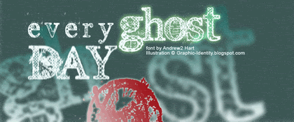
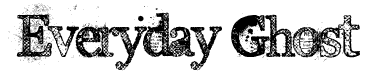
Everyday Ghost
bigger view
By Andrew2 Hart
Site: Dirt2.com
Andrew made a Serif Grunge and his choice is Georgia. These fonts are more eroded in the certain caps, which are: B, D, E, G, H, O, Q, R, U. I made a special illustration for this font and you can see how the red O is quite dirty in appearance. I guess this font is related to Typewriter typefaces. You can see outer soft lining for body type (which is typically found in typewriter fonts), only this one is condensed. They have medium weight with detailed textures. Everyday Ghost fonts have normal baseline and posture so you should modify it for a bit to create more erratic effect in illustration.
Plague Death
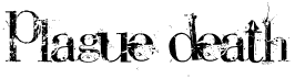
By Andrew2 Hart
Site: Dirt2.com
Other grunge style versions of Bauer Bodoni, designed by Andrew2 Hart. It is interesting how he loves to have classic serif to be destroyed, and Plague Death fonts are erratic in posture with medium contrast. All of them in small caps, ultra condensed, and pretty uniform in textures.
The Poison
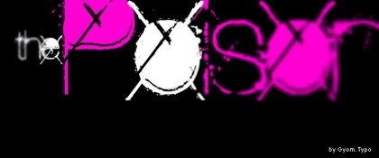
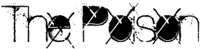
by Gyom Seguin (Last Soundtrack)
site: GyomNebullus.com
Mixed body weight by putting cross line and blocks shadow for certain types (caps: A, B, D, O, P, Q, R and small caps: a b d e g o q). The fonts that have no graphic in detail (cross-line and blocks shadow) are light in weight. The Poison fonts are ultra condensed, therefore is not easy to read and its best used for short headlines display at large size.
Sidewalk
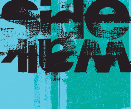
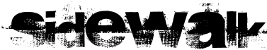
by Gyom Seguin (Last Soundtrack)
site: GyomNebullus.com
Bittbox http:bittbox.com have reviewed this font before.
All in small caps yet they are bulky and highly condensed. The grunge design looks, clearly show the unusual texture. I might say this more like defect printed ink on each font, and not only just look dirty. Textures are more frequent in below. The typefaces are mixed case, weight and height.
Epoxy History
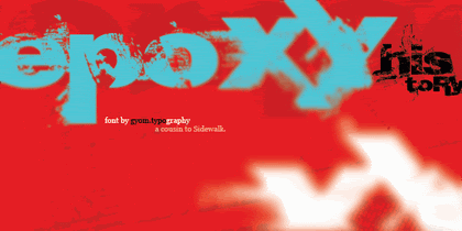

by Gyom Seguin (Last Soundtrack)
site: GyomNebullus.com
Gyom Seguin called his Epoxy History design as a cousin to Sidewalk. Yes, not much I can tell because they have lots of similarity, except for the stroke distortion and the texture detail. The Epoxy History texture is more looks like plastic warp.
Base 02
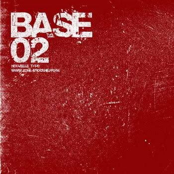

by StereoType
site: Stereo-Type.net
Base 02 is a simple grunge font, and all are capitals. Shredded paper can be found in its textural detail. We will see uniform weight strokes, extreme bold and font condensed in Base 02 typefaces.
Thanks for the tips! I love finding new fonts. Your post looks like a series of horror movie reviews.
ReplyDeleteHi hi..you're welcome..well ya..I was kindda cönfuse to make Everyday Ghost illustration..and turned out to be something scary..
ReplyDelete