Sunday, August 19, 2007

6 Free Graffiti, Grunge, and Destroyed Fonts

I browse the Da Font recently and I decide to share the most “destroyed” fonts with you. All of these fonts are free for personal use. You can download them by visiting Da Font and don’t forget to visit the Font Authors personal site. Grunge fonts are more likely identified by their texture details and sometimes erratic in posture, weight or height.
I got two grunge fonts created by Andrew 2 Hart and three others by Last Soundtrack. In the end of my font review I come up with StereoType’s new font, which titled “Base 02”. Click each font’s title and its illustration to start the download.


Everyday Ghost

Everyday Ghost

bigger view


Everyday Ghost

By Andrew2 Hart
Site: Dirt2.com
 
Andrew made a Serif Grunge and his choice is Georgia. These fonts are more eroded in the certain caps, which are: B, D, E, G, H, O, Q, R, U. I made a special illustration for this font and you can see how the red O is quite dirty in appearance. I guess this font is related to Typewriter typefaces. You can see outer soft lining for body type (which is typically found in typewriter fonts), only this one is condensed. They have medium weight with detailed textures. Everyday Ghost fonts have normal baseline and posture so you should modify it for a bit to create more erratic effect in illustration.


Plague Death

Plague Death
Plague Death

By Andrew2 Hart

Site: Dirt2.com
 
Other grunge style versions of Bauer Bodoni, designed by Andrew2 Hart. It is interesting how he loves to have classic serif to be destroyed, and Plague Death fonts are erratic in posture with medium contrast. All of them in small caps, ultra condensed, and pretty uniform in textures.


The Poison

The Poison

The Poison

by Gyom Seguin (Last Soundtrack)
site: GyomNebullus.com
 
Mixed body weight by putting cross line and blocks shadow for certain types (caps: A, B, D, O, P, Q, R and small caps: a b d e g o q). The fonts that have no graphic in detail (cross-line and blocks shadow) are light in weight. The Poison fonts are ultra condensed, therefore is not easy to read and its best used for short headlines display at large size.


Sidewalk


Sidewalk

Sidewalk

by Gyom Seguin (Last Soundtrack)
site: GyomNebullus.com
 
Bittbox http:bittbox.com have reviewed this font before.
All in small caps yet they are bulky and highly condensed. The grunge design looks, clearly show the unusual texture. I might say this more like defect printed ink on each font, and not only just look dirty. Textures are more frequent in below. The typefaces are mixed case, weight and height.


Epoxy History

Epoxy History

Epoxy History

by Gyom Seguin (Last Soundtrack)
site: GyomNebullus.com

Gyom Seguin called his Epoxy History design as a cousin to Sidewalk. Yes, not much I can tell because they have lots of similarity, except for the stroke distortion and the texture detail. The Epoxy History texture is more looks like plastic warp.


Base 02

Base 02

Base 02

by StereoType

site: Stereo-Type.net

Base 02 is a simple grunge font, and all are capitals. Shredded paper can be found in its textural detail. We will see uniform weight strokes, extreme bold and font condensed in Base 02 typefaces. 

Sunday, August 12, 2007

Colors for your Blog

I always interested to everyone’s opinion about choosing color scheme for their blog and
I started a discussion on Blog Catalog several days ago on that topic.

The result is interesting and I come out with a conclusion that most of Bloggers tend to use grayscale to white as background layout. This is good since white or gray makes easy for eyes to capture the whole blog content, especially if your blog is rich in text content.

Dark background works very well for a photo blog. Photos or images that you post would look amazing if you choose black or dark blue as background color. Contrast balance between the background and the content will helps the audience to focus only to what you want to show. Of course you will also need typefaces in brighter color for headers and paragraph.

I wrap up color palette of these blogs that I reviewed into 3 (three) major colors. This is my way to determine what kind of moods and sense appears in every blog.

These are the blog snapshots of everyone who has joined in the discussion.

This post is updated in 19th August 2007 !

1. Tyler
Temporarily Distraught - music/mp3 blog

Photo Sharing and Video Hosting at Photobucket

Photo Sharing and Video Hosting at Photobucket

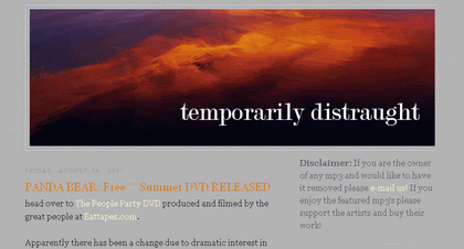
Tyler’s Blog brings out contemporary looks and the composition between warm color, which is orange and cool gray. Gaming, sports, and popular culture especially music, make their influence known through these colors as well. The header’s color (warm burgundy to orange) and graphic is actually an eye catching spot, a counterpoint, and the gray background is, however, sophisticated and disconnected despite its density.

2. Daisy
Daisy the Curly Cat

Photo Sharing and Video Hosting at Photobucket

Photo Sharing and Video Hosting at Photobucket

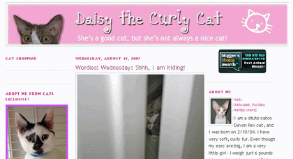
Daisy is cute, and the blog should be a perfect home for her. Daisy presented monotone color in pink hues. These sweet colors are refreshed up with the light background, that is white gray. We know that Daisy is a girl just by the look of the blog. Pink is identically related to female favorite colors. Friendly inviting, sweet, and once again it is so cute.

3. Borzack
Healthy Lifestyle

Photo Sharing and Video Hosting at Photobucket

Photo Sharing and Video Hosting at Photobucket

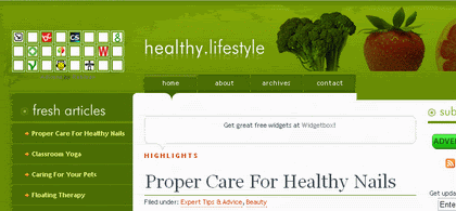
Healthy Lifestyle Blog is clearly show how organic colors related to the process of healing. Intense Green Hues color brings up vitality, health and energy. The viewers would be emotionally ground and feels the sense of ecological thoughtfulness.

Making Myself Extra Money

Photo Sharing and Video Hosting at Photobucket

Photo Sharing and Video Hosting at Photobucket

Making Myself Extra Money used interesting color combination for a Monetizing Blog. Vivid intense colors (blue and green) are the consequences of dark background color. This color combination is a symbolic of the techno genre. Highly saturated blue and green evoke the raw input of the computer monitor and they are contrasted with black to help reinforce the extreme nature and energy of techno style.


4. Vishnu
Arbitrary Servings from the Noodle Joint upstairs

Photo Sharing and Video Hosting at Photobucket

Photo Sharing and Video Hosting at Photobucket

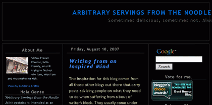
Vishnu’s blog brings powerful concept into the design, which feels reliable, has visual depth or complexity. Bright cobalt blue reinforced its intensity by powerful black background. Pale yellow pastel is very good choice for the text color since this color is delicate but fairly contrasts and adds vitality to the whole design.


5. Morina
Something to talk about...

Photo Sharing and Video Hosting at Photobucket

Photo Sharing and Video Hosting at Photobucket

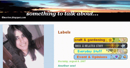
Morina loves blue and orange for the sidebar and white background for the contents! She said: “It gives a refreshing look”. Well I completely agree with her. I should add a comment that this is a new age color, a return to the familiarity of the natural and sometimes nostalgic coloring of the past combines with vivid colors in the new age palette. Blue and orange are the influence of popular culture – while mutted color represented by cool gray is quiet, elegant, natural and even creates spiritual hues.


6. Marisa
Marisa's Dandelion Patch

Photo Sharing and Video Hosting at Photobucket

Photo Sharing and Video Hosting at Photobucket

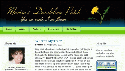
Natural and refreshing colors are dominant in Marisa's Dandelion Patch Blog. Light blue sky and vivid green are analogous combinations create a more subdues, watery experience. Refreshing colors raises a crisp, bright feeling that connotes energy, health and coolness. Adding black to the header, makes for a vivacious tension among the other fresh colors that is nevertheless mysteriously powerful.


Scribble On The Wall

Photo Sharing and Video Hosting at Photobucket

Photo Sharing and Video Hosting at Photobucket

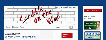
Scribble on the Wall Blog uses deep cobalt blue complementary cool red of medium value and intense saturation. In combination with cool gray, red immediately references the aesthetic of period that is machine age. The red titling on header typefaces commonly seen in printed ephemera fro the time.


7. Cameron Battagler
Tetsujin's Blog

Photo Sharing and Video Hosting at Photobucket

Photo Sharing and Video Hosting at Photobucket

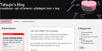
Tetsujin Blog brings tranquil sense. Grayscale and Pink pastel create cool, soothing, yet not particularly refreshing, colors. Lighter warm grays are particularly relaxing and offer the added indeterminate quality of neutrality as an invitation to thoughtfulness. Pink pastel connotes comfort and safety. This color composition is also analogues with short wavelengths; therefore it is easy for the brain to capture the whole content.


8. Blackysky
Blackysky World

Photo Sharing and Video Hosting at Photobucket

Photo Sharing and Video Hosting at Photobucket

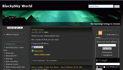
Another dark background form BlackSky Blog, creates powerful looks. The header image determines typefaces color. Interesting combination between green and yellow on the typefaces intensify their energies and dynamic. Yellow and green are rich but also have a harmonic relationship and increasing the design complexity.


9. Kiwipulse
KIWIPULSE // ROCK YOUR WORLD

Photo Sharing and Video Hosting at Photobucket

Photo Sharing and Video Hosting at Photobucket

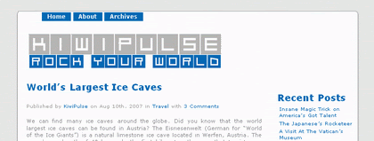
Kiwipulse Blog chooses gray and blue. This is unique since gray and blue associated to corporate colors of choice. The sense of competence and reliability dominates the whole design hence implies authority and vitality. The look is clean and simple or we can say “less is more”.


10. Brian Gill
Apathetic Lemming of the North

Photo Sharing and Video Hosting at Photobucket

Photo Sharing and Video Hosting at Photobucket

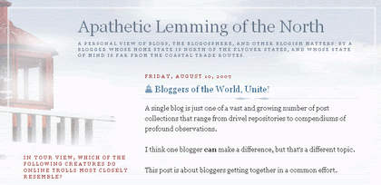
We know that this design theme is official Blogger template. This is another example of corporate color scheme. But the use of saturated red adds a sense of power that helps invigorate the neutrality and reliability of both dark and light blue.


Easy Griller

Photo Sharing and Video Hosting at Photobucket

Photo Sharing and Video Hosting at Photobucket

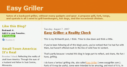
Easy Griller is another default Blogger Template which uses a friendly color schemes. Golden yellow close to orange is sunny but has the adventurous overtone of orange. These analogues of hue may be perceived a friendly because of the close chromatic relationship.

Saturday, August 4, 2007

Color Pic 4

Price : Free
File size : 663 Kb
Download : www.iconico.com

Color Pic is the best color grabber and easy to use. I would say that Color Pic is practical graphic software for a busy designer. This design software, works on the top of your desktop PC window, in front of any other active application which runs in the same time.

It has 16 chips to view your most recent picked color and you can label your color chips collection in a palette tool which placed on the top.

There are 5 tools that you need to know to have optimized benefit of Color Pic.
You can hide and show them by clicking small blue arrow icon toggle panel next to each tool


These tools are:

1. Palettes
With this tool, you can label each color collections that you have in color chips. As a designer, I rely on this because I can manage my designs which have different theme style and of course they will have different color composition for the layout. Having the hexadecimal color typed in my text editor and not be able to quick understand which color would that is are the reason for me to install Color Pic in my PC. I just need to choose one of my Palettes collections which saved before by clicking New button. Palette name can be renamed by clicking Edit button, and you can always Delete a Palette if you feel that you won’t need it anymore.

Photo Sharing and Video Hosting at Photobucket


2. Chips

This tool enables you to save 16 kinds of colors that you use the most which fits to each palette. Click one of the empty chips to start grabbing a certain color, then move your cursor around to find match color to save and press Ctrl + G to grab. Click keys F1, F2, …….to select color chips.


3. Color
Color tool provides you a preview of the color you clicked on Chips tool, and there are two options of color code; these are Decimal Color and Hex Color. Click copy button, and you can paste the color code to any clipboard..

Photo Sharing and Video Hosting at Photobucket

Paste this to any graphic software, (Photoshop) color picker tool and you will get full color accuracy that you want for your design.

Photo Sharing and Video Hosting at Photobucket


4. Mixer

There are 4 types of mixer panels. You can find them on left side of Color Pic by tabs. You can decide to use one of them depends to your familiarity to mix color. Each color mixer system has special tools and equipped with user friendly interface. Click one of the color chips to modify it, and set the new value of color system for different result by dragging cursor tip. The color systems that used in the Mixer Tools are RGB and CMYB.

Hex color Mixer
Photo Sharing and Video Hosting at Photobucket

Rainbow Color Mixer
Photo Sharing and Video Hosting at Photobucket

Hue Color Mixer
Photo Sharing and Video Hosting at Photobucket

Sliders Color Mixer
Photo Sharing and Video Hosting at Photobucket


5. Magnify

Photo Sharing and Video Hosting at Photobucket

With magnify tool, you can Zoom in maximum to x36 of image or anywhere on desktop area to grab color. Set the Point for your convenient picker cursor tip size and check Hi-Lite to show or hide the tip. There is an option to change color of the tip so you can easily viewing the tip when you drag it in dark or bright color. Check Grid to show in magnification area for more accurate color. Remember that this tool only work in empty or new chip box. Drag the tip cursor, and press Ctrl + G to grab color.

Wednesday, August 1, 2007

Paint.NET

A Free image and photo editor for today’s review will be Paint. NETwhich is developed on the .NET Framework. This software is an open-source freeware editor and now enters the new Paint.NET version 3.08. Although it is a freeware, it has much more essential graphic tools for a pro compared to the average image editors.

As we all know that average image editors which are free tend to have limited tools for further graphic manipulation. We might think about basic image editor tools such as: resizing, cropping, rotate/flip, and other standard image editor to adjust exposure, sharpness and color or some few sort of pluggins to create decent photo retouch. Well that kind of software not even close to Adobe Photoshop for a pro graphic designers.

Paint.NET is light graphic software that supports the most image formats (JPEG, PNG, GIF, TIFF and other) but yet it is powerfully enough as you can create layers. Paint.NET also supports actions manager, and unlimited undo thru out your photo editing process. Special features such as clone stamp, Lasso, Select, and Magic Wand are also included.
Some comments delivered to this software said that this software is much better than Microsoft Paint.

This Paint.NET latest version (3.08) has been improved better than the previous version Paint.NET v 2.5, Paint.NET v 2.6, and Paint.NET v 3.0 which released MDI (multi-document interface) to make easier multiple image editing. The interface and the panels are semitransparent, equipped with a tab strip in the upper right corner of the main window. Much convenient for any skill levels who wants to have fast result for image or photo retouch but relied on high end features tools.

The installment files 1.36 MB in size; it requires Windows XP / 2003 Server / Vista, and Microsoft.NET Framework 2.0.

Users are mostly commented on how unpleasant to have such relatively small size file installment of this terrific graphic software when you still need to download the Microsoft.NET Framework 2.0 which has 22MB file size, unless you have a faster internet connection to establish that kind of platform.

Photo Sharing and Video Hosting at Photobucket

Bigger view

Further Readings: