Saturday, December 29, 2007

DotArt Paintings

DotArt is about dots that flicker, dance, move, pulsate and so on…….


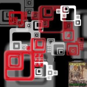
The artist called himself as: Dot Art Dude, all the way come from Metairie, Louisiana, United States.

His unusual art is something that I want to learn more from him. He is also a good friend of mine that I know from Blog Catalog. If you visit Dot Art Dude’s Blog Catalog profile, you will see that he runs long listing of multiple blogs beside DotArt Blogspot, which you can join them as blog neighborhood if you are already become a Blog Catalog member.

Here is an online interview I have with him last week:

How you describe yourself?

I am a 43-year-old artist who generates ideas faster than I can produce them. Besides drawing and painting, I also enjoy working in photography and video. My other interests include: Apple Macintosh, education, film, music, politics, psychology, science, sociology, technology, theater, writing and wit.

DotArt Paintings


On a blog post which titled Thumbnails for Next Batch (published in November 15, 2007) it looks like you tried to arrange your painting elements on to some
kind of story board before you paint them to a canvas medium.
Do you always follow this process to all your paintings?


Using the piece of enamel board to arrange my Post-It thumbnails was just a means of presenting them in a photo on my blog. The Post-It thumbnails became a part of my process when I wanted to add dots to a grid painting. Working out a pattern of dots first was more important than just starting anywhere.

Prior to my dot art, I worked more by intuition. It was after college that I reacted against thumbnails. The art I created when I had less pre-planning was more exciting for me at that time. Even though I now use thumbnails for my dot art, I often change what I'm doing along the way. Working out the design on my small canvases is more necessary.


Any insights in your creative process?

The dot pieces begin as an idea on a list. Each one comes from one of the following: an experience, a place, a film, an object or an art show. These are items that made an impression on me. I then take the idea and draw a simplified representative thumbnail. From there I choose colors for the background and the dots based on the origin of my idea.

There are three basic ways I arrange the dots: grid-like, alternating and random. With each new piece I experiment with my techniques. The newer works have become more complicated than earlier ones. As I paint more canvases my process continues to evolve.

My process is a bit slow since I work in stages. Often I'll stop so I can look at a piece from a distance. Sometimes a design is just not working and I have to make an adjustment. Once in a while I'll have to let a piece sit a while until I have a solution.

DotArt Paintings


You produce abstract paintings, but I think they are more like
decorative paintings to me. What is your opinion about this?


Yes, they are decorative. Unlike my earlier artwork, I am able to sell these consistently to both tourists and locals. Sure my other works sell too, but I have a finite amount space to store art at home.

This is the first time I have been able to work in series and not become bored. Each piece is different enough to keep me excited about what I am doing. With each new piece I continue to innovate my technique.

Since I've been making dot art, I now notice the use of dots everywhere I go. This past year, there was a Vatican mosaic art show in town. Even though mosaics are made up of squares, I found the show interesting because of the artwork I'm doing.

DotArt Paintings


What is your main concern in choosing colors for your artworks?

The colors come from the original inspiration for my idea in some way - whether direct or by association: an experience, a place, a film, an object or an art show. Even though, I'm asked to do bright colors because they sell better, I'll stick to the relevant colors.


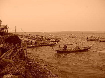
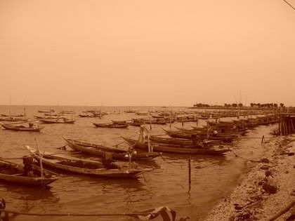
Katrina Hurricane and the damaged caused by the flood apparently affected him deeply...but in someway, his paintings were developed more than before.

What interests you most to bring inspirational sense to your
paintings? And why?


The themes I choose are ones that are important to me - individual moments if you will. They help me stay passionate about the pieces so I can finish them. I want my pieces to communicate my joy of painting.

Producing these paintings has become a coping mechanism for me following Hurricane Katrina and the flood. There are constant reminders that I face daily. By the same token there are improvements over what existed before. This area has a tendency to resist progress and preserve the past.

DotArt Paintings


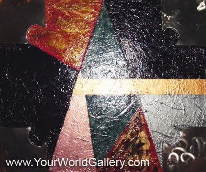
Do you have any significance reason why you give a geometric shape of art to your style and how it reflects the human condition and our connection to nature? Please give any example of your painting collections to explain your answer.

Five years ago, I was working with a grid pattern on four paintings while teaching art to high school students. Use of a grid grew out of trying to explain principles of design to them. When I was not satisfied with how the paintings were turning out, I decided to add dots to kill the harshness of the triangle shapes in the paintings.

Using Post-It Notes to help organize what I was doing, I drew dots in geometric patterns. I then added these dot patterns to my paintings. As I continued to work this way, I kept looking for new patterns to try. I didn't want to keep repeating the same patterns. As the summer movie season arrived I found ideas in movies I saw.

Not until my evacuation to Memphis did I find a way to regularly paint the dots and not repeat the patterns. I started keeping a list of subjects: an experience, a place, a film, an object or an art show. Each one is a moment from Memphis, or more recently, New Orleans.

Mo has also invited us to see his new uploaded paintings on his Flickr account :
www.flickr.com/photos/moart/


What is a good art supposed to be?

I believe good art should be moving. It should make a viewer stop and reflect on it. It should resonate the presence of its creator.


"In the booming of digital era euphoria", how you find your self in it?

I see the digital era euphoria as a wonderful period of opportunity to have my art seen by people around the world and receive feedback about it from viewers and my fellow artists.


Who is your favorite artists and why?

Takashi Murakami is my current favorite artist. I'm intrigued by his “super flat” art that mixes new and old traditions of a “floating world.” He works two-dimensionally and three-dimensionally. Too often I see art that looks like a rehash of an art movement from before the 1980s. His work is exciting to me.

DotArt Paintings


Your avatar is unique, can you explain about your curent avatar?

DotArt Paintings

The current paintings I'm blogging about in detail were made from my stay in Memphis. The ones from events after that are sometimes related to pictures I've taken. I bought a digital camera in late October '05.

My current avatar is based on lobby rug colors from the Renaissance Arts Hotel in the New Orleans Arts District (formerly Warehouse District - revived area initiated by the 1984 World's Fair). The lobby, restaurant and atriums are filled with art. I thought I should explain that to you since you have included the painting in the article. In effect I'm telling you something I haven't yet covered in my blog.

My point is I'm slowly working through the past art in more detail now that there is some distance. By now I have a better perspective on these pieces. In fact some have more meaning(s) now than when I first created them. Also, my current production is still kind of slow when I make newer ones.

If you like the art you see here, most pieces are for-sale. You can contact him directly from his DotArt Blogspot Blog or from his Blog Catalog profile.
My greatest appreciate to you, Mo! It was a fun trip to understand more about your unique art style. All the best to you!


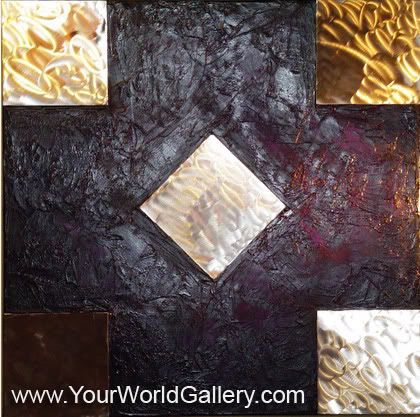
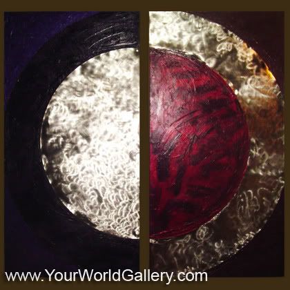
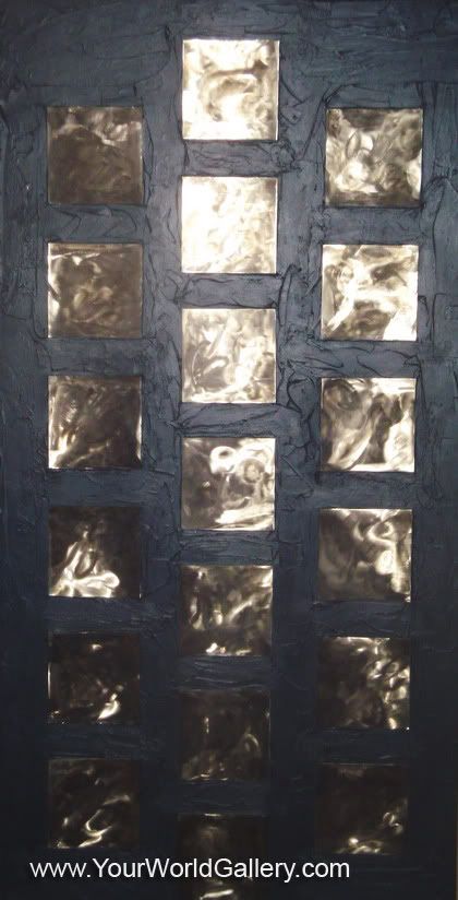
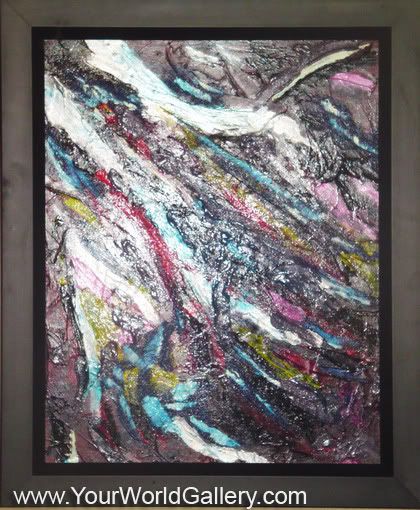
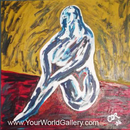
Mo's artworks prior to DotArt:

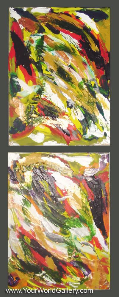
Mo's artworks that lead to "DotArt":

Mo's artworks site that are not "DotArt":

Saturday, December 15, 2007

Blogspot Design Showcase Blogs

When it comes to do the illustration or design search for your inspiration, sometimes search engines just provides you enormous list. But I wonder if any of you know that some of Blogspot Bloggers are actually dedicated their time to build interesting design showcase for your eyes! Such of hidden treasures I found for this lovely weekend.

These blogs are pretty new, some of them even started on November, and here comes the parade:


Photoshop Heaven

Blogspot Design Showcase Blogs

Poerty is the author, and used to write his blog "Photoshop Heaven" in German, but I believe you can now read the posts in English also.

Started in June 2007, Poerty presents you short reviews on some photoshop designs of another artist and his own artworks. Wonderfully sorted of digital imaging designs and breathtaking photos edited by profesional Photoshop artist.

Check out Poerty's Blogger profile , and it is no surprise that he or she is also a great deviant*
;)
Aw...I will also introduce you his or her site, Photoshop Heaven.de where you can download classic style free photoshop brushes, and tutorials

deviant* = a term used for the member of Deviantart.com

Blogspot Design Showcase Blogs

Blastyle

Blogspot Design Showcase Blogs

ADDD, is the author of this blog described Blastyle:
This blog is supposed to be my individual selection of designs that I notice. "What kind of designs?" Almost any kind of design: web, logo, ads, T-shirts.. The list might be endless if the following criteria is fulfilled- the design has to be really awesome.
Ow ya, the design showcase really is awesome. I like how Addd picked wide range of designs showcase, from illustration to typography style and even painting. He wrote short descriptive reviews on great posters from different artist.

Check out Addd's Blogger profile and being published for the first time in November 2007, this self domain hosted Blogspot Blogger worth to visit!

Illustration Design Blog

Blogspot Design Showcase Blogs

It is built and run by the members of the Graphic Design & Illustration Forum
A forum where you can sign up to talk about Graphic Design and Illustration with other Designers.

This blog is built to showcase some of the best Illustrators, Illustrations and Vector Graphics from around the internet and in the Illustration Design World.

Started in August 2007, Illustration Design Blog has tons collection of inspirational list of graphics and artworks from extraordinary designers. Actively updated, don't missed out their latest post by subscribing in feed reader.

The complete lists are outstanding, but unfortunately I didn't find few words of review for each design poster. I think, a blog should create such dialogue with its viewers, hope that the admin would consider this in the future ;).


Do you want your Blogspot Design Showcase being reviewed here also?

Submit your blog under these terms:
  • Your blog has to be graphic design or visual art related (paintings, graffiti art, urban art, photography, web design, manga drawings etc.) that contain listing of another designers project or even your own gallery portfolios.
  • Highly updated, and each post has one or couple lines of review ;).
  • Your blog must be new or classic Blogspot Blogger.
  • All blog will be checked before accepted and published. If your blog fits the criterion, you will get a notification via email.

Just contact me if you're interested, and don't forget to include your: blog description, author bio, and screenshot to my email at: kukuhumi [at] gmail [dot] com :p.

Graphic Identity is PR 3, so if your blog is quite new, you can have the link love from my blog to help increasing your blog page rank.

Saturday, December 1, 2007

Collin James De Ruyck’s Abstract Paintings

I always fascinate to abstract paintings. I found sort of well mixed medium of abstract paintings collection of Collin James De Ruyck , and I’m also amazed how he lined up the geometric shape and colors to create 3D texture effect. I should call it: “Decorative Abstract Paintings

Somehow each of them can be part as an interior decoration. His abstract art works are able to bring a boring plan room to a very exciting room filed with great colors and style.

Here a short conversation about his artworks that might give you a clue about his paintings ;).

Collin James De Ruyck’s Abstract Paintings


When did you first start painting?

I first started painting in 2003. It was after my x wife moved out and took all the furniture and I had nothing to look at buy bare walls. I was talking with a friend of mine who pushed my to start painting as he told me what I was looking for from art did not really exist, which is the style I currently use.


Who and what were some early influences?

Like I said in the last question, it was a good friend of mine named Rohn who helped me get started at a very tough time in my life.


What does your current practice (artworks) consist of?

Right now all I do is abstract, with stainless steel but I plain on getting into welding in the future to bring a more 3d effect to my paintings and really make them pop! I also want to try sculpting with stainless steel.

Collin James De Ruyck’s Abstract Paintings


Where do you draw the line between painting and fine art, both
generally and in your own practice?


Well I am not to sure what you would class as fine art really. To me if I fall in love with a piece, then its fine art. But if there is a class called fine art, I am not in it and with all the amazing artists out there I hope no one ever calls my art fine. They need that class way before I do.

Collin James De Ruyck’s Abstract Paintings


Is there a preferred medium that you utilize? Especially for the fine art.

I use acrylics mostly combined with stainless steel on canvus.

Collin James De Ruyck’s Abstract Paintings

Collin James De Ruyck’s Abstract Paintings


What is your favorite project that you have worked on so far?

All of them but the one I call "Waiting" was the funnest for me because I can't draw and most people who look at it can tell its a women sitting down. I cant wait to try another one like that.

Collin James De Ruyck’s Abstract Paintings


What path have you followed to become a full-time artist?

This is going to be a short answer; I am not full time but would love to be someday if all goes well.


What are some contemporary influences?

Don't really have any influences at this point. Everyone has there own style, and there is a lot of amazing artists out there with talents I could only dream of having. I just hope that maybe one day my skills can improve and maybe sell some pieces I have done and bring a smile to someone’s face.

Collin James De Ruyck’s Abstract Paintings

If you like the art you see here, most pieces are for-sale. You can send him email if there is something you would like to see made just for you at:
collin_deruyck[ at ]yahoo[ dot ]ca

Thank you so much, Collin! It was a pleasure diving into your experimental abstract painting. Good luck for you!

Sunday, November 4, 2007

Legal Usage of Graphic Identity's Free Design Box

Legal Usage to employ Graphic Identity’s “Free Design Box” files:

Creative Commons License

You may not:

  • Create any hotlinking to Graphic Identity direct download URL
  • Replace my design preview image watermark with your own logo or your own watermark, as if you created the preview image yourself.
  • Redistribute Graphic Identity original zip (or rar) file on your own site, and sell them to another third party.
  • Upload Graphic Identity original zip (or rar) file on your own self hosted site, and offer my files as a download, as if you created the files yourself.

You are Free to:
  • Use Graphic Identity files in posters, website designs, cd covers, postcards, annuals, flyers, business cards, branding or any kind of design whether for personal or commercial use.
  • Take a screenshot or grab an image from one of my posts and link back to the post if you want to allow your visitors access to Graphic Identity’s ‘Free Design Box’ Files.

By using Graphic Identity’s ‘Free Design Box’ files, content, or both you agree to these terms and conditions which are subject to change without notice. Violating these terms and conditions could and will result in punishment to the maximum extent under law.

For further information, please read and understand about CC licenses before you download Graphic Identity’s ‘Free Design Box’ Files.

Wednesday, October 31, 2007

My Design is Beautifully Ripped Off

I was shocked knowing that one of my Photoshop freebies being hijacked by some other Bloggers for their own benefit. Since this was my first experience, I’m getting intense to find out how to prevent this issue.

You can tell how your work of art becomes popular using site tracker tool. As I’ve been checking my stat regularly, I found that, one of my Photoshop freebies gets good attention from some reader segment. I used “Round Corner Photoshop Brushes” as anchor text for every link related and image alt. I didn’t mean to search down for hijacking items on my design. I went to Google to find out how my blog post rank result in “Round Corner Photoshop Brushes” keywords. Sadly but true, I found 5 sites doing copyright violation on my design. They simply erased my watermark tagline on the preview image, and replaced it with their own logo, as if they have created it by themselves. No link back or attribution definitely, and they provide re-self-hosted link to download the file.

Carefully compare these two image snapshots! The image below is originally designed by me, and at the next one is thief’s handmade craft upon my original design.

Round Corner Square Photoshop Brushes

Photo Sharing and Video Hosting at Photobucket

I protect all of my designs under CC license ,

but I wasn’t sure how it would work effectively since my country (Indonesia) is not available in license governed by the Copyright Law of a specific jurisdiction.

Creative Commons License


This annoying experience could happen to anyone…to designers who blog, blog journalists, or blog researchers. Anyone who stole your valuable contents should not deserve the time and effort that you spent in such easy way

Bhizwiz wrote a very useful article: Prevent Content Theft and Copyright Infringement

It contains brief explanation of steps to take when your contents are stolen.

But I still feel such a dilemma on this matter. Would those thieves coming back with another form of attack if I’m willing to take those steps?

I remember how Bittbox , clearly stated licenses and usage when presenting its early design freebies series. I quoted this from its nice article freebies: Free Vector Glass Header Designs – Fancy

“I would like to clear up a little confusion with this post: These Files are FREE. Some of you were confused because I stated that “You may, under no circumstance, redistribute these files” (I already removed this statement, as well as the readme file in all of my downloads). What I meant by that is: You may not rehost my original zip file on your own site, and offer my files as a download, as if you created the files yourself, that’s all. Every single file I offer is completely and utterly free. You may use them however you see fit. Use them as is, modify them, put them in your new software app. Hell, use them as part of a logo! I don’t care, as long as you don’t re-gift them. I’m tired of an Ugly internet, so I decided to flood it as best as I can on my spare time, with some good shit. I hope that clears things up. And thank All of you for the kind reviews and comments, your feedback is priceless to me. Cheers ~BittBox.”

Just for a good reference that I want to point out, I like how BittBox presents its Free Design Resources based on specific License and Usage

Freebies download can attract much reader, but….most of the time, this is quite tricky and needs extra handling.

If you are a BlogCatalog user, you can enter a discussion about this violation which I started previously...your feedback will help me a lot…and lots of Bloggers who experienced the same thing. Help us stop this problem to role again next time ahead.


Related Links:

Monday, October 15, 2007

Blog Action Day : Environmental Awareness

October 15, is Blog Action Day , and the theme this year is "environment".

Blog Action Day : Environmental Awareness

Joanne of Laidback Buddhist, pointed me out about the Blog Action Day. I've been planning to write a short post about a beach near my hometown, in north-east of Surabaya, Indonesia.

There is a small population of fishermen, where all the people depending so much to find living from the seashore until 5 kilometers far of radius from it. The fisherman community would about to vanish in another 5 years or shorter.

It was started when the local government decided to build 10 km Highway Bridge to connect the main island of East Java, Indonesia to a small island called Madura. According to one of the fishermen community member, they are now can hardly find fish and their income has been decreasing ever since. The sea environment was destroyed by the massive highway development.

I realized that, how the ruin of an environment can influence to human community in general sense. The feeling of insecure to all the community members and of course some new social problems triggered by that environmental issue.

Here are some photos that I want to share for you! showing everyday life in that small fishermen community....

Blog Action Day : Environmental Awareness

Blog Action Day : Environmental Awareness

Blog Action Day : Environmental Awareness

Blog Action Day : Environmental Awareness

Sunday, September 16, 2007

CSS Tab Designer 2.0

Price : Free
File size: 1.35 MB
Download : http://www.highdots.com/css-tab-designer/


Understanding CSS may take times for some of people. Especially if it is dealing with CSS tab buttons for the website. CSS Tab Designer will make that easy for you. Because you don’t need to be a master of CSS script to implement amazing horizontal menus (tabs) or vertical menus design in your website.

I have known this tool since two years back and still rely on it quite sometimes. The tabs in my Graphic Identity blog are using Centered Sliding Doors tab style. I modified their grey background into white, to blend with my main column background color.

There are 11 designers who have contributed their CSS tab design in this software. All tabs (60+ different designs/colors supported) have been designed beautifully and easy to modify using CSS Tab Designer. The code generated for these tabs is strict xhtml compliant code.

CSS Tab Designer 2.0

CSS Tab Designer 2.0

How to create tabs in CSS Tab Designer?

You will see three columns in CSS Tab Designer 2.0 interface.

CSS Tab Designer 2.0

Bigger View

Start from the columns in the middle, where you can find all Tab Styles. Every tab style has its own name label. Pick one tab style. In this example, I choose Tab Menu 8.

CSS Tab Designer 2.0

Search the left sidebar to find Task menu (at the center of sidebar) and click Fill with sample. Edit your tab’s label, URL, and order at Items menu.

CSS Tab Designer 2.0

See the result in the right sidebar, where you can find Preview and Code tabs displayed together (at the bottom of sidebar).

CSS Tab Designer 2.0

Switch the tab to copy the CSS and HTML scripts to your own Blog HTML.

CSS Tab Designer 2.0

You can see the tabs style in the 7 different browsers also if you go to Browser Preview tool.

CSS Tab Designer 2.0

Next to the browser preview, you can click Font Size icon tool, and pick the most suitable font size for the tabs.

CSS Tab Designer 2.0

You almost finish, in another few steps. After the installment, CSS Tab Designer by default will create folder directories in your computer system hardisk, which labeled CSS Tab Designer 2. Find the folder, and go to styles folder.

CSS Tab Designer 2.0

In styles folder you can find each of Tab Style types that you have found in this software interface. As we know, every tab style has its own name label. Find a folder which is exactly related to your tabs and copy the images inside that folder.

CSS Tab Designer 2.0

Upload these images to your web hosting server and replace their image URL (inside the code script) with the new one that you would have after uploading files.


;) Your tabs are now online!!!

Monday, September 3, 2007

3 Free Destroyed Typewriter Fonts

I’m coming back with another font review, and don’t be so surprised since this post is closely related to my previous font review: 6 Free Graffiti, Grunge, and Destroyed Fonts.

I think I’m addicted to dig any kind of font that looks ruin apart, dirty and destroyed ;)

Junko’s Typewriter

3 Free Destroyed Typewriter Fonts - Junk'o Typewriter

3 Free Destroyed Typewriter Fonts - Junk'o Typewriter


By: Junkohanhero 2006
Site: Junkohanhero.com
Free for personal use

Junko’s Typewriter reminds me to an old typewriter, because the baseline of this font is not inline or unordered. Not much textures, but pretty solid in each character. Classic shape of terminals and serifs definitely make them different than any other typewriter fonts.


Uncle Typewriter


3 Free Destroyed Typewriter Fonts - Uncle Typewriter

3 Free Destroyed Typewriter Fonts - Uncle Typewriter

By: Typo 5
Site: Typo5.com
Free for commercial or not commercial use

Eroded and dirty at the first look, caused by font’s characters texturized background. Most of Uncle Typewriter fonts are in small caps. Capitals letters are available only for D, E, and M characters. Some fonts are so much destroyed and hardly to recognize (e, c and o)


Typewriter from Hell

3 Free Destroyed Typewriter Fonts - Typewriter from Hell

3 Free Destroyed Typewriter Fonts - Typewriter from Hell


By: Jakob Fischer
Site: Pizzadude.dk
Free for non-commercial use only

Every Typewriter from Hell font character has a unique and uniform texture. There is some kind of cracking font or a result of digital plastic wrap filter. No textures in every font’s background. You will see pointillism effect if you use smaller and medium font size.

Sunday, August 19, 2007

6 Free Graffiti, Grunge, and Destroyed Fonts

I browse the Da Font recently and I decide to share the most “destroyed” fonts with you. All of these fonts are free for personal use. You can download them by visiting Da Font and don’t forget to visit the Font Authors personal site. Grunge fonts are more likely identified by their texture details and sometimes erratic in posture, weight or height.
I got two grunge fonts created by Andrew 2 Hart and three others by Last Soundtrack. In the end of my font review I come up with StereoType’s new font, which titled “Base 02”. Click each font’s title and its illustration to start the download.


Everyday Ghost

Everyday Ghost

bigger view


Everyday Ghost

By Andrew2 Hart
Site: Dirt2.com
 
Andrew made a Serif Grunge and his choice is Georgia. These fonts are more eroded in the certain caps, which are: B, D, E, G, H, O, Q, R, U. I made a special illustration for this font and you can see how the red O is quite dirty in appearance. I guess this font is related to Typewriter typefaces. You can see outer soft lining for body type (which is typically found in typewriter fonts), only this one is condensed. They have medium weight with detailed textures. Everyday Ghost fonts have normal baseline and posture so you should modify it for a bit to create more erratic effect in illustration.


Plague Death

Plague Death
Plague Death

By Andrew2 Hart

Site: Dirt2.com
 
Other grunge style versions of Bauer Bodoni, designed by Andrew2 Hart. It is interesting how he loves to have classic serif to be destroyed, and Plague Death fonts are erratic in posture with medium contrast. All of them in small caps, ultra condensed, and pretty uniform in textures.


The Poison

The Poison

The Poison

by Gyom Seguin (Last Soundtrack)
site: GyomNebullus.com
 
Mixed body weight by putting cross line and blocks shadow for certain types (caps: A, B, D, O, P, Q, R and small caps: a b d e g o q). The fonts that have no graphic in detail (cross-line and blocks shadow) are light in weight. The Poison fonts are ultra condensed, therefore is not easy to read and its best used for short headlines display at large size.


Sidewalk


Sidewalk

Sidewalk

by Gyom Seguin (Last Soundtrack)
site: GyomNebullus.com
 
Bittbox http:bittbox.com have reviewed this font before.
All in small caps yet they are bulky and highly condensed. The grunge design looks, clearly show the unusual texture. I might say this more like defect printed ink on each font, and not only just look dirty. Textures are more frequent in below. The typefaces are mixed case, weight and height.


Epoxy History

Epoxy History

Epoxy History

by Gyom Seguin (Last Soundtrack)
site: GyomNebullus.com

Gyom Seguin called his Epoxy History design as a cousin to Sidewalk. Yes, not much I can tell because they have lots of similarity, except for the stroke distortion and the texture detail. The Epoxy History texture is more looks like plastic warp.


Base 02

Base 02

Base 02

by StereoType

site: Stereo-Type.net

Base 02 is a simple grunge font, and all are capitals. Shredded paper can be found in its textural detail. We will see uniform weight strokes, extreme bold and font condensed in Base 02 typefaces.