Price : Free
File size: 1.35 MB
Download : http://www.highdots.com/css-tab-designer/
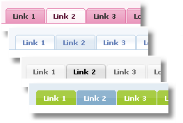
Understanding CSS may take times for some of people. Especially if it is dealing with CSS tab buttons for the website. CSS Tab Designer will make that easy for you. Because you don’t need to be a master of CSS script to implement amazing horizontal menus (tabs) or vertical menus design in your website.
I have known this tool since two years back and still rely on it quite sometimes. The tabs in my Graphic Identity blog are using Centered Sliding Doors tab style. I modified their grey background into white, to blend with my main column background color.
There are 11 designers who have contributed their CSS tab design in this software. All tabs (60+ different designs/colors supported) have been designed beautifully and easy to modify using CSS Tab Designer. The code generated for these tabs is strict xhtml compliant code.
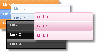
How to create tabs in CSS Tab Designer?
You will see three columns in CSS Tab Designer 2.0 interface.
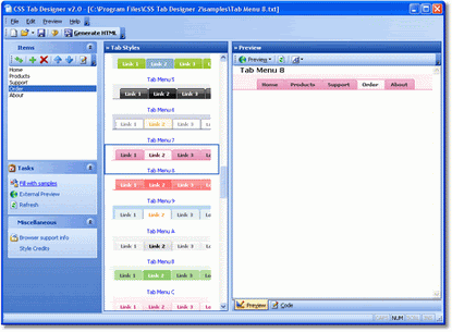
Bigger View
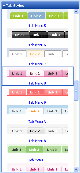
Start from the columns in the middle, where you can find all Tab Styles. Every tab style has its own name label. Pick one tab style. In this example, I choose Tab Menu 8.
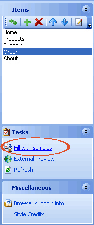
Search the left sidebar to find Task menu (at the center of sidebar) and click Fill with sample. Edit your tab’s label, URL, and order at Items menu.
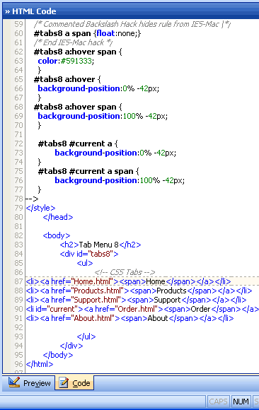
See the result in the right sidebar, where you can find Preview and Code tabs displayed together (at the bottom of sidebar).
Switch the tab to copy the CSS and HTML scripts to your own Blog HTML.
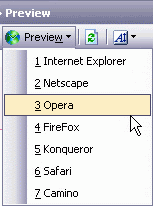
You can see the tabs style in the 7 different browsers also if you go to Browser Preview tool.
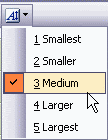
Next to the browser preview, you can click Font Size icon tool, and pick the most suitable font size for the tabs.
You almost finish, in another few steps. After the installment, CSS Tab Designer by default will create folder directories in your computer system hardisk, which labeled CSS Tab Designer 2. Find the folder, and go to styles folder.
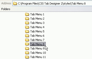
In styles folder you can find each of Tab Style types that you have found in this software interface. As we know, every tab style has its own name label. Find a folder which is exactly related to your tabs and copy the images inside that folder.
Upload these images to your web hosting server and replace their image URL (inside the code script) with the new one that you would have after uploading files.
;) Your tabs are now online!!!
Sunday, September 16, 2007
Monday, September 3, 2007
3 Free Destroyed Typewriter Fonts
I’m coming back with another font review, and don’t be so surprised since this post is closely related to my previous font review: 6 Free Graffiti, Grunge, and Destroyed Fonts.
I think I’m addicted to dig any kind of font that looks ruin apart, dirty and destroyed ;)
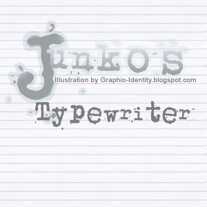
Junko’s Typewriter
By: Junkohanhero 2006
Site: Junkohanhero.com
Free for personal use
Junko’s Typewriter reminds me to an old typewriter, because the baseline of this font is not inline or unordered. Not much textures, but pretty solid in each character. Classic shape of terminals and serifs definitely make them different than any other typewriter fonts.
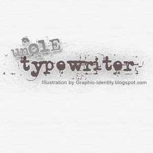
Uncle Typewriter
By: Typo 5
Site: Typo5.com
Free for commercial or not commercial use
Eroded and dirty at the first look, caused by font’s characters texturized background. Most of Uncle Typewriter fonts are in small caps. Capitals letters are available only for D, E, and M characters. Some fonts are so much destroyed and hardly to recognize (e, c and o)
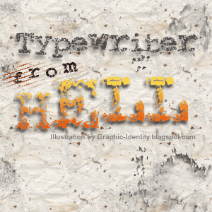
Typewriter from Hell
By: Jakob Fischer
Site: Pizzadude.dk
Free for non-commercial use only
Every Typewriter from Hell font character has a unique and uniform texture. There is some kind of cracking font or a result of digital plastic wrap filter. No textures in every font’s background. You will see pointillism effect if you use smaller and medium font size.
Subscribe to:
Posts (Atom)