Showing posts with label font review. Show all posts

Monday, September 3, 2007

3 Free Destroyed Typewriter Fonts

I’m coming back with another font review, and don’t be so surprised since this post is closely related to my previous font review: 6 Free Graffiti, Grunge, and Destroyed Fonts.

I think I’m addicted to dig any kind of font that looks ruin apart, dirty and destroyed ;)

Junko’s Typewriter

3 Free Destroyed Typewriter Fonts - Junk'o Typewriter

3 Free Destroyed Typewriter Fonts - Junk'o Typewriter


By: Junkohanhero 2006
Site: Junkohanhero.com
Free for personal use

Junko’s Typewriter reminds me to an old typewriter, because the baseline of this font is not inline or unordered. Not much textures, but pretty solid in each character. Classic shape of terminals and serifs definitely make them different than any other typewriter fonts.


Uncle Typewriter


3 Free Destroyed Typewriter Fonts - Uncle Typewriter

3 Free Destroyed Typewriter Fonts - Uncle Typewriter

By: Typo 5
Site: Typo5.com
Free for commercial or not commercial use

Eroded and dirty at the first look, caused by font’s characters texturized background. Most of Uncle Typewriter fonts are in small caps. Capitals letters are available only for D, E, and M characters. Some fonts are so much destroyed and hardly to recognize (e, c and o)


Typewriter from Hell

3 Free Destroyed Typewriter Fonts - Typewriter from Hell

3 Free Destroyed Typewriter Fonts - Typewriter from Hell


By: Jakob Fischer
Site: Pizzadude.dk
Free for non-commercial use only

Every Typewriter from Hell font character has a unique and uniform texture. There is some kind of cracking font or a result of digital plastic wrap filter. No textures in every font’s background. You will see pointillism effect if you use smaller and medium font size.

Sunday, August 19, 2007

6 Free Graffiti, Grunge, and Destroyed Fonts

I browse the Da Font recently and I decide to share the most “destroyed” fonts with you. All of these fonts are free for personal use. You can download them by visiting Da Font and don’t forget to visit the Font Authors personal site. Grunge fonts are more likely identified by their texture details and sometimes erratic in posture, weight or height.
I got two grunge fonts created by Andrew 2 Hart and three others by Last Soundtrack. In the end of my font review I come up with StereoType’s new font, which titled “Base 02”. Click each font’s title and its illustration to start the download.


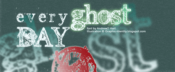
Everyday Ghost

Everyday Ghost

bigger view


Everyday Ghost

By Andrew2 Hart
Site: Dirt2.com
 
Andrew made a Serif Grunge and his choice is Georgia. These fonts are more eroded in the certain caps, which are: B, D, E, G, H, O, Q, R, U. I made a special illustration for this font and you can see how the red O is quite dirty in appearance. I guess this font is related to Typewriter typefaces. You can see outer soft lining for body type (which is typically found in typewriter fonts), only this one is condensed. They have medium weight with detailed textures. Everyday Ghost fonts have normal baseline and posture so you should modify it for a bit to create more erratic effect in illustration.


Plague Death

Plague Death
Plague Death

By Andrew2 Hart

Site: Dirt2.com
 
Other grunge style versions of Bauer Bodoni, designed by Andrew2 Hart. It is interesting how he loves to have classic serif to be destroyed, and Plague Death fonts are erratic in posture with medium contrast. All of them in small caps, ultra condensed, and pretty uniform in textures.


The Poison

The Poison

The Poison

by Gyom Seguin (Last Soundtrack)
site: GyomNebullus.com
 
Mixed body weight by putting cross line and blocks shadow for certain types (caps: A, B, D, O, P, Q, R and small caps: a b d e g o q). The fonts that have no graphic in detail (cross-line and blocks shadow) are light in weight. The Poison fonts are ultra condensed, therefore is not easy to read and its best used for short headlines display at large size.


Sidewalk


Sidewalk

Sidewalk

by Gyom Seguin (Last Soundtrack)
site: GyomNebullus.com
 
Bittbox http:bittbox.com have reviewed this font before.
All in small caps yet they are bulky and highly condensed. The grunge design looks, clearly show the unusual texture. I might say this more like defect printed ink on each font, and not only just look dirty. Textures are more frequent in below. The typefaces are mixed case, weight and height.


Epoxy History

Epoxy History

Epoxy History

by Gyom Seguin (Last Soundtrack)
site: GyomNebullus.com

Gyom Seguin called his Epoxy History design as a cousin to Sidewalk. Yes, not much I can tell because they have lots of similarity, except for the stroke distortion and the texture detail. The Epoxy History texture is more looks like plastic warp.


Base 02

Base 02

Base 02

by StereoType

site: Stereo-Type.net

Base 02 is a simple grunge font, and all are capitals. Shredded paper can be found in its textural detail. We will see uniform weight strokes, extreme bold and font condensed in Base 02 typefaces. 

Tuesday, July 24, 2007

16 Font ter-Favorit dalam Desain Web

6 Font di urutan pertama di bawah ini adalah font yang termasuk dalam kategori “web safe”, karena font-font tersebut didukung oleh sebagian besar browser di segala platform. 2 Font berikutnya biasanya ter-install secara default pada sebagian besar platform tetapi tidak pada semua sistem. Untuk 8 font di urutan selanjutnya, biasanya digunakan untuk tujuan dekoratif dan di-implementasikan dalam Web sebagai sIFR atau disimpan dalam format image.

1. Helvetica, Helvetica Neue, Arial
Font Helveticadiciptakan oleh seorang designer Swiss pada 50 tahun yang lalu, Helvetica adalah salah satu font yang paling sering digunakan secara luas untuk kategori typefaces sans-serif. Banyak sekali perusahaan terkenal seperti American Airlines, Lufthansa, dan Toyota yang memilih font ini untuk kebutuhan branding perusahaan. Terdapat banyak variasi Helvetica ketika pada tahun 1983, Linotype mengeluarkan font Helvetica Neue yang menghasilkan jenis Helvetica dengan gaya yang lebih tersusun secara struktural. Banyak yang menganggap bahwa Arial, yang didesain lebih dari 30 tahun setelah Helvetica, merupakan font tiruan Helvetica. Tetapi kemudian disadari bahwa Arial ternyata lebih memiliki banyak kesamaan dengan Univers dibandingkan dengan Helvetica.

Photo Sharing and Video Hosting at Photobucket

Photo Sharing and Video Hosting at Photobucket

2. Verdana
Verdana didesain secara khusus untuk Microsoft pada tahun 1996 dengan tujuan untuk dapat lebih mudah dibaca pada ukuran minimum di layar komputer. Tidak adanya elemen serif, proporsinya yang lebar dan spasi huruf yang bebas membuat font ini sangat memenuhi syarat untuk digunakan dalam website.

Photo Sharing and Video Hosting at Photobucket

3. Georgia
Georgia adalah font lain yang dipesan khusus oleh Microsoft pada tahun 1993, dimana font ini memiliki banyak persamaan dengan Times New Roman, namun perbedaan mendasar diantara keduanya adalah Georgia berukuran lebih besar secara umum. Sangat bagus digunakan untuk ukuran kecil maupun besar, dan seringkali menjadi pilihan di kalangan web designer sebagai pengganti untuk penggunaan font Times New Roman yang sudah tidak menjadi trend lagi.

Photo Sharing and Video Hosting at Photobucket

4. Trebuchet MS
Trebuchet MS juga merupakan font resmi yang digunakan oleh Microsoft dan menjadi “web design font terbaik” pada tahun 1996. Terlihat sangat bagus ketika digunakan untuk Header dengan ukuran font yang besar. Vivien menggunakan font ini dalam blognya: Inspiration Bit.

Photo Sharing and Video Hosting at Photobucket

5. Century Gothic
Century Gothic disebut juga dengan font jenis sans-serif yang bentuknya “geometris”, didesain pada tahun 1991, Century Gothic memiliki kesamaan dengan Avant Garde Gothic. Baik untuk header, namun Vivien tidak merekomendasikan font ini untuk keperluan sub title di dalam body text.

Photo Sharing and Video Hosting at Photobucket

6. Lucida Sans Unicode, Lucida Grande
Lucida Grande adalah font yang digunakan pada seluruh Sistem Operasi Macintosh, walaupun demikian Lucida Sans Unicode juga merupakan font yang dipakai pada Sistem Operasi Windows. Keduanya termasuk pada jenis sans-serif yang sifatnya “humanist”, dimana font tersebut memiliki bentuk yang paling kaligrafis diantara keluarga sans-serif.

Photo Sharing and Video Hosting at Photobucket

7. Palatino
Palatinodidesain oleh Herman Zapf pada tahun 1948 dengan tampilan bentuk huruf yang terinspirasi oleh era Renaissance. Beberapa dekade setelahnya, Microsoft mendistribusikan imitasi dari font tersebut dengan nama Book Antiqua yang dirancang oleh perusahaan Monotype.

Photo Sharing and Video Hosting at Photobucket

8. Garamond, Baskerville, Caslon
Garamond dibuat khusus untuk seorang raja Perancis pada tahun 1540 dan dengan cepat digunakan oleh banyak orang untuk keperluan percetakan. Bagaimanapun juga, versi modern dari jenis font ini sebenarnya dipopulerkan oleh perusahaan Apple. Font ini digunakan dalam edisi hardcover buku Harry Potter dan sejarah singkat dari font ini dijelaskan dalam halaman terakhir pada buku tersebut:

Photo Sharing and Video Hosting at Photobucket

Teks di dalam buku ini menggunakan font Adobe Garamond berukuran 12-point, suatu jenis font yang di desain oleh Claude Garamond pada abad ke enam belas, dan di desain ulang oleh Robert Slimbach pada tahun 1989.


Baskerville dirancang oleh John Baskerville pada tahun 1757 dengan tujuan untuk meningkatkan kualitas bentuk font Caslon yang didesain oleh William Caslon.

Photo Sharing and Video Hosting at Photobucket

9. Univers Condensed, Linotype Univers
Univers , seringkali menjadi rancu dengan Helvetica. Universe didesain oleh Adrian Frutiger pada tahun 1956. Frutiger menjadi terkenal karena ia menciptakan sistem klasifikasi font yang unik. Univers tanpa diragukan adalah font yang sangat bagus untuk dibaca pada jarak yang relatif jauh, oleh karena itu font ini digunakan oleh peruasahaan Swiss International Air Lines, Deutsche Bank dan untuk tombol keyboard pada komputer Apple.

Photo Sharing and Video Hosting at Photobucket

10. Myriad Pro
Myriad Pro - dirancang terutama untuk Adobe System pada awal 90’an. Sejak tahun 2002, Myriad menjadi font resmi perusahaan Apple, menggantikan Apple Garamond. Myriad sangat bagus digunakan baik untuk kebutuhan percetakan dan typography web.

Photo Sharing and Video Hosting at Photobucket

11. Rockwell
Rockwell tergolong dalam slab serif di dalam klasifikasi font, terutama karena “serifs-nya yang lepas dan memiliki tebal yang merata pada elemen horisontal huruf.” Font ini digunakan terutama untuk tujuan dekoratif dibandingkan untuk penggunaan body text yang ditulis dalam kalimat panjang.

Photo Sharing and Video Hosting at Photobucket

12. Warnock Pro
Warnock Pro dinamakan demikian sesuai dengan nama belakang John Warnock, yang merupakan salah satu pendiri Adobe Systems Inc. Font tersebut menjadi jenis huruf yang paling disukai pada abad ke XXI.

Photo Sharing and Video Hosting at Photobucket

13. FF DIN
“DIN” merupakan singkatan dari “Deutsche Industrie Norm” sebagai font standard industri bangsa Jerman, dirancang pada tahun 1995 oleh seorang desainer Belanda yang berdomisili di Hamburg, oleh karenanya font ini memiliki kesan yang modern.

Photo Sharing and Video Hosting at Photobucket


14. Gotham
Gotham adalah font lain yang dirancang pada abad XXI. Bentuk font Gotham yang geometris dan ukuran tinggi huruf yang relatif besar membuatnya sangat mudah dibaca pada ukuran yang kecil.

Photo Sharing and Video Hosting at Photobucket


15. Frutiger
Frutiger adalah font lain yang dirancang oleh Adrian Frutiger, namun kali ini ia menciptakannya untuk sebuah perusahaan yang baru berdiri pada tahun 1968, yaitu Charles De Gaulle International Aiport. Sangat mengherankan karena dibutuhkan waktu selama 7 tahun baginya untuk akhirnya dapat menyelesaikan desain font tersebut. Wikipedia menyebutkan bahwa “Frutiger adalah font paling laris dijual oleh perusahaan Linotype saat ini”.

Photo Sharing and Video Hosting at Photobucket


16. Dax Regular
Dax Regular adalah salah satu font terbaru di abad ke XXI, namun menjadi sangat populer di dalam dunia periklanan dan marketing. Seringkali digunakan oleh UPS, dan juga digunakan untuk kebutuhan branding New Democratic Party di negara Kanada.

Photo Sharing and Video Hosting at Photobucket

Artikel ini adalah versi Indonesia dari artikel yang berjudul

16 Best-Loved Font Bits In Web Design


ditulis oleh: Vivien dalam blognya : Inspiration Bit

Tuesday, June 26, 2007

Brian Kent's Fonts Design Collection

There is no clue about Brian Kent when I downloaded his font design collection back then. All I know that I really love its techno design look, and then I decided to download it. I got these sort collections from Da Font. Latter I realized that he is my favorite type designer since most of his design always be the first pick in my work. "Jeopardize" by Brian Kent is the main font I use for Graphic Identity Logo and Banner.

Simplification and the loss of junctures or strokes are common in Brian Kent's design. Most of them are techno typefaces which often attempt to reflect the idea of electronic media in their drawing, using stylized joints, angular joints, erratic baseline, and modular logic to bring a sense of the digital. Decorative inclusions, such as large dots, graphic shapes, abstract details and inline are also common among most of Brian Kent's type design.

You can visit his personal homepage ÆNIGMA GAMES & FONTS at:
http://www.aenigmafonts.com/ and download his font for free. I mean absolutely free because you can use them any way you want to for Personal use, Commercial use, or whatever. But he make an exception since you may not sell or distribute his fonts for profit or alter them in any way without asking him first. [e-mail - kentpw@norwich.net]


Bumped

Photo Sharing and Video Hosting at Photobucket


Encapsulate


Photo Sharing and Video Hosting at Photobucket


Jeopardize

Photo Sharing and Video Hosting at Photobucket


Granular

Photo Sharing and Video Hosting at Photobucket


Opiated

Photo Sharing and Video Hosting at Photobucket


Sequence
Photo Sharing and Video Hosting at Photobucket